The Story of Shantell Sans
Shantell Sans mixes variable axes for Weight, Italic, Informality, and Bounce to deliver a wide array of font styles, from friendly, readable, everyday typographic workhorses to striking, high-energy, experimental styles meant especially for animation.
This is the story behind its inspiration and creation.
Why make a new font?
Shantell Martin, Artist
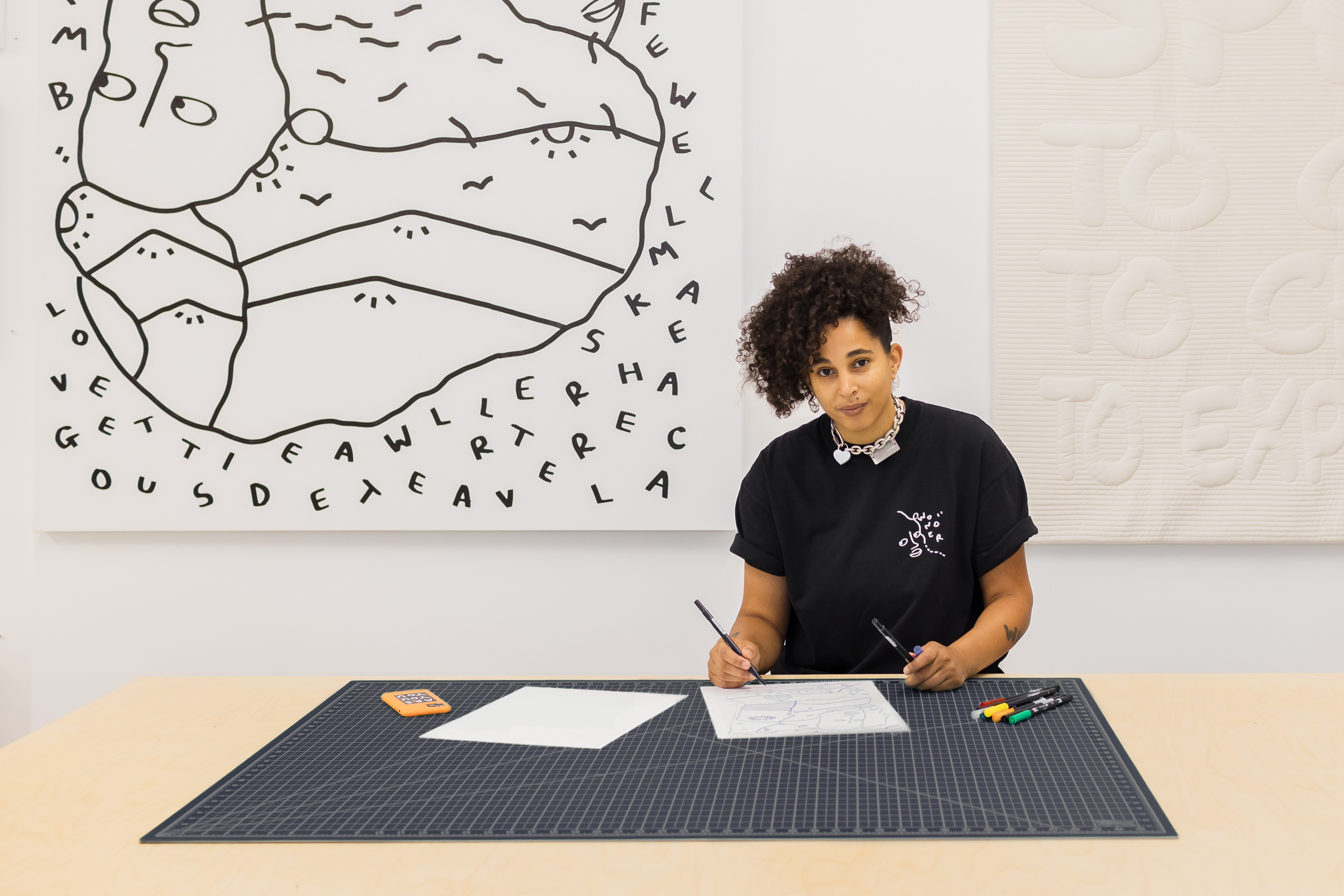
One of my first relationships with words was back in elementary school. We did spelling tests every week. Since I never passed them, I had to sit in detention.
Despite being scared of the spelling tests, I loved words. I wrote and drew a lot. I knew that words helped me to express my feelings and feel better. Since I was writing for myself, I didn’t have to care about spelling.
When I was 20 or 21, I found out that I was dyslexic. When I started my art degree at Central Saint Martins in London, I was in an environment where it felt like the majority of people were dyslexic. I was instantly part of a cool group of creative people. However, I was disappointed about the amount of teachers who had never spotted my reading challenges. Instead of supporting me to learn to read and write, they punished me.
Creating my own font was a way to empower people to read and write, despite their relationship to words. What if I take my words, or my handwriting or the letters that I’ve created, and make a font that is fun and playful, but also professional and usable? I wanted to make a font that feels accessible and open to remind people, including myself, that words are drawings and that words can exist on our own terms.
I was inspired by the Comic Sans typeface. Since I was a kid, I have liked how playful and easy it was to read text in Comic Sans, especially for me as a dyslexic.
I think we have an emotional response to fonts. A font might feel easier to read, or it feels more welcoming. Or it feels like something I want to look at or pick up. I definitely like fonts that have a little bit more space, because they feel more approachable. If you have a really tiny, fancy font, I don’t want to touch it.
The usage of a font can make that font take on a certain personality. If you’re very dyslexic, you’re likely not going to pick up a book printed in a tiny font with words very close together. It feels intimidating. Or if the font is very plain and boring, it doesn’t capture your attention enough to want to spend time with it.
To start this project, Stephen Nixon sent me a template, with lines on it for me to handwrite all of the Latin alphabet, numbers, and symbols. He used my handwriting to create a digital font.
Giving the font away
To make the font as useful as possible, I am releasing Shantell Sans under an open font license. It’s my gift to the world. Having the font be available without charge means that a wide variety of people will have access to Shantell Sans. It also means that the font will be widely available through Google Fonts and other platforms.
I wanted to create a typeface by a living artist, and perhaps inspire other living artists to create their own typography. I’m curious to see what people will do with it. I’m giving up control over something that is innately mine since Shantell Sans is based on my handwriting and is quite personal.
I would really love to see children and young adults use Shantell Sans and learn about how it came about. I want to see it being used for personal projects, or even bigger design projects. I think with something like this, when you put it out into the wild, it’s going to be used in ways that you probably didn’t even think of.
Early uses of Shantell Sans
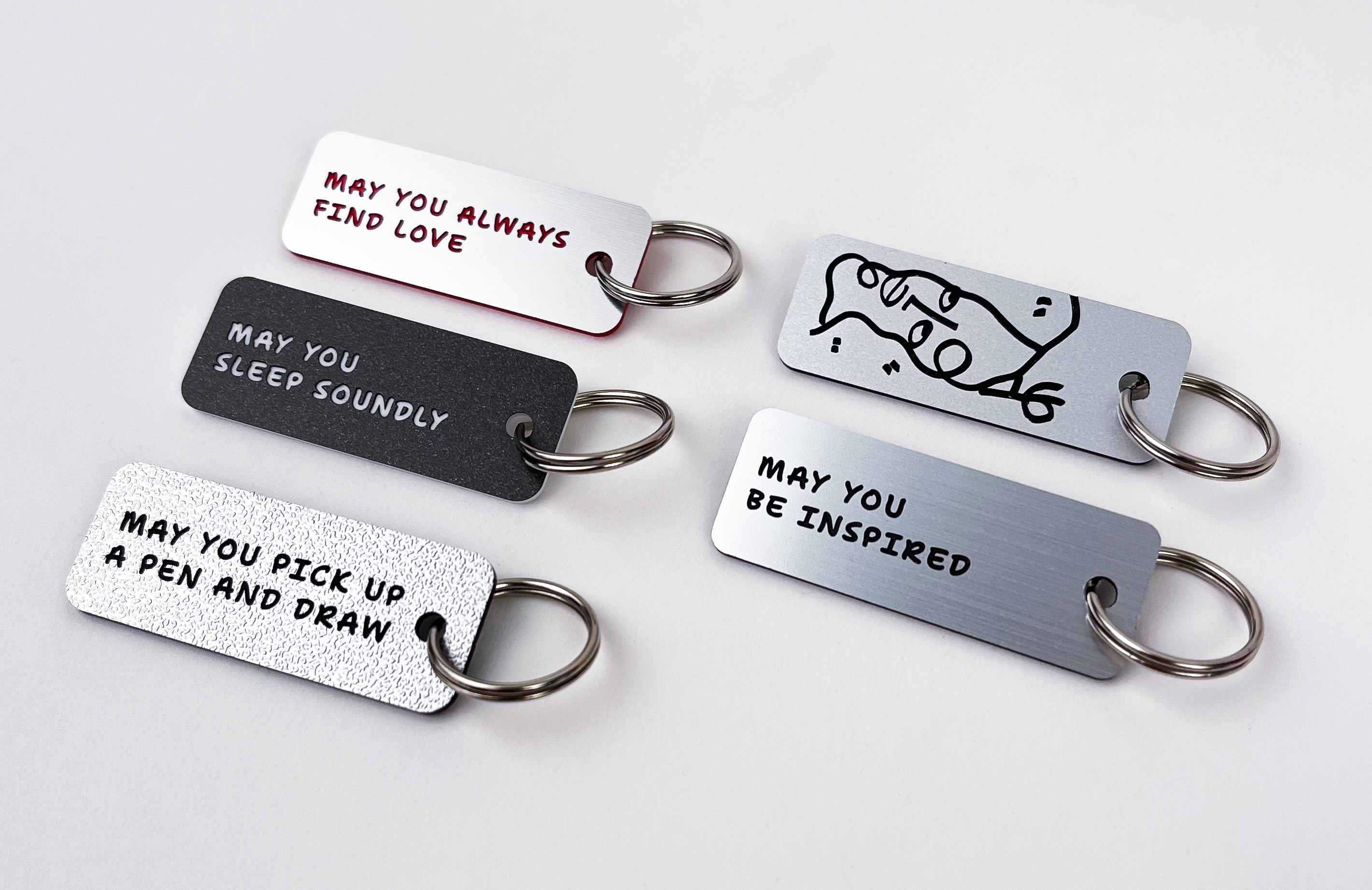
I have started to use Shantell Sans in some of my projects. I designed key tags with Shantell Sans type for the Whitney Museum shop in New York City.
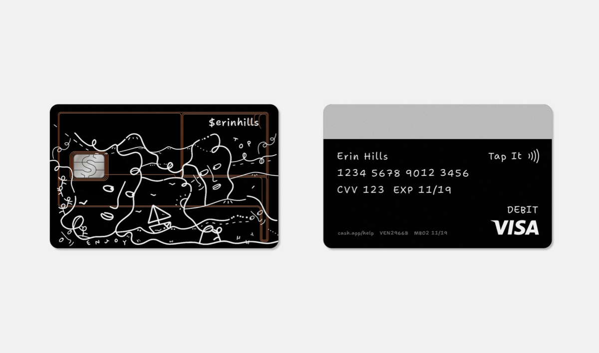
Working with Cash App, a financial services platform, I helped create a cash card. The cash tag and the numbers and everything on the back of the card is in Shantell Sans.
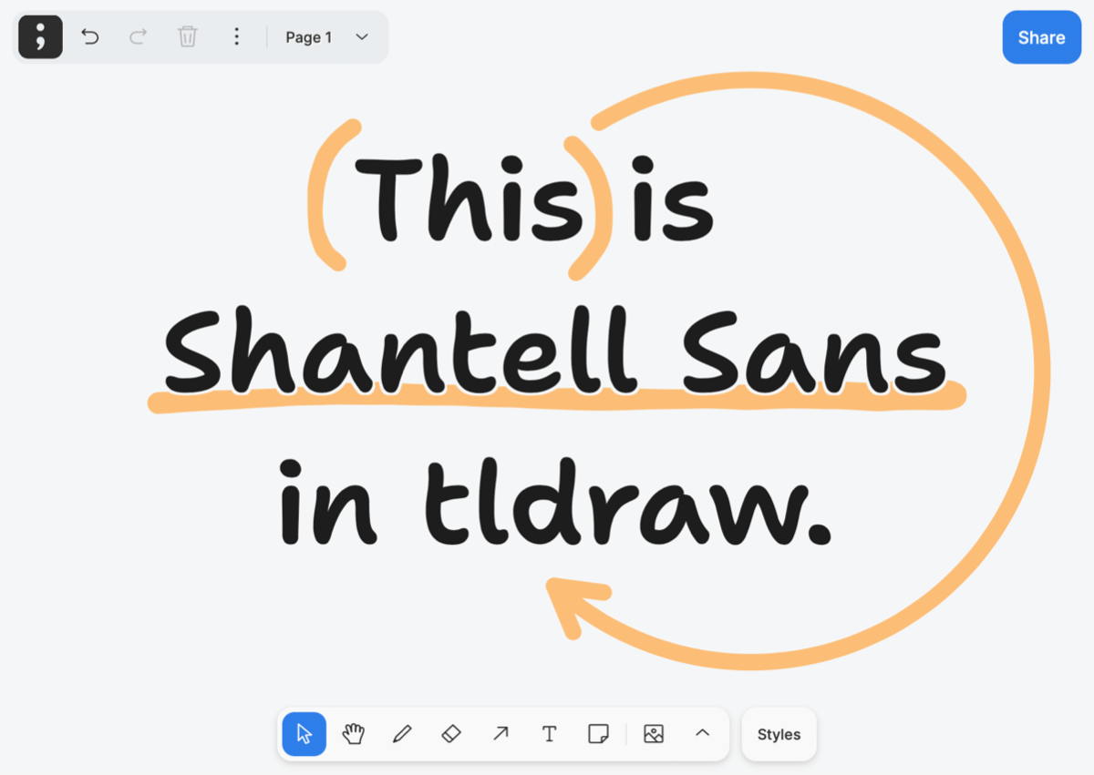
Beyond that, a few other brands have started to find creative uses for Shantell Sans.
It’s been used by tldraw, a collaborative drawing app on the web, as the primary font for writing.
It’s also been made into a web-building template by univer.se, an app that lets users build websites on their phone.
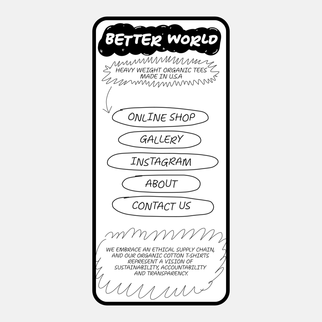
And now, Shantell Sans is available via Google Fonts, Google Docs, and as a download from its open repo on GitHub – so anyone can start creating with it.
If you do make something with Shantell Sans and post it to social media, use the hashtag #shantellsans – I’d love to see what you create!
Design Process
Stephen Nixon, type designer & font developer (ArrowType)
I felt both honored and keenly interested when Shantell first reached out to me asking for a custom font, saying that she was “looking to make a usable, visually pleasing, smart, creative typeface.” I first encountered Shantell’s work in the form of large-scale murals, which I love for their exploratory, semi-spontaneous, and playful line artwork, and I was so excited to learn about Shantell’s wider range of creative and technological work.
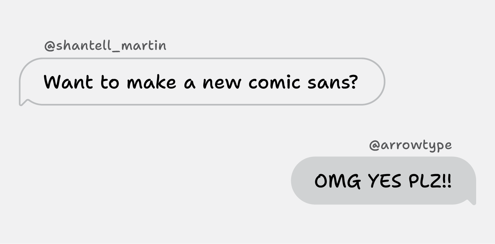
We chatted a bit about what that typeface might be, but what truly caught my attention were four words: Shantell said she wanted to make “a new Comic Sans.”
Heck yes – that was a prompt I could get into. Few typefaces have reached the levels of cultural ubiquity as Comic Sans. Everyone has feelings about it – whether positive or negative. In my mind, a mark of a successful creative work is that it elicits an emotional response. If you love Comic Sans, you probably find it fun and approachable in a way that most stiff, ultra-serious typefaces can’t match. If you hate Comic Sans, maybe ask yourself why. Is it really objectively bad, or can a typeface be good in more ways than you may have considered?
Like most successful typefaces, Comic Sans was actually made for a very specific purpose, before gaining adoption far beyond that initial use case. Comic Sans was designed by Vincent Connare in 1994 as a font for Microsoft Bob, which was software intended to provide a more-approachable user interface for Windows. As described on Wikipedia:
Microsoft Bob presented screens showing a “house,” with “rooms” that the user could go to containing familiar objects corresponding to computer applications—for instance, a desk with pen and paper, a checkbook, and other items. In this case, clicking on the pen and paper would open the word processor. … A cartoon dog named Rover and other cartoon characters provided guidance using speech balloons.
Microsoft Bob was released before Comic Sans could be completed, and Bob itself didn’t last long due to lukewarm reception by reviewers and users. However, Comic Sans went on to be pre-installed in both Windows and Mac operating systems, where its unique appearance has since endeared it to a vast amount of users, making it used in everything from the tags on Ty Beanie Babies (from the 5th generation on) to a 2012 CERN presentation on the Higgs Boson particle.
To be clear, the Shantell Sans project was never really about making a new version of Comic Sans, or anything directly derived from it. Rather, we sought to identify what makes Comic Sans so popular, and apply a few of those lessons to a totally new font.
Design Goals
But what might “a new Comic Sans” really mean, today? And, how could that typeface extend naturally from Shantell Martin’s artistic universe? These questions led to the following design goals:
- The font should appeal to everyday computer users – not just to typography enthusiasts.
- The font should be easy to use in a wide variety of communication.
- The font should be usable and available to a wide range of people.
- The font should be legible and easy to read.
- The font should do something new, rather than simply rehash old territory.
1. Everyday Appeal
For the font to have an everyday appeal, it should be based on felt-tip marker handwriting, similar to Comic Sans. For this, Shantell’s handwriting was a perfect place to start from. We worked to keep some of the quirks of that writing, while also simplifying the overall look into something true to a digital form.
2. Easy to Use
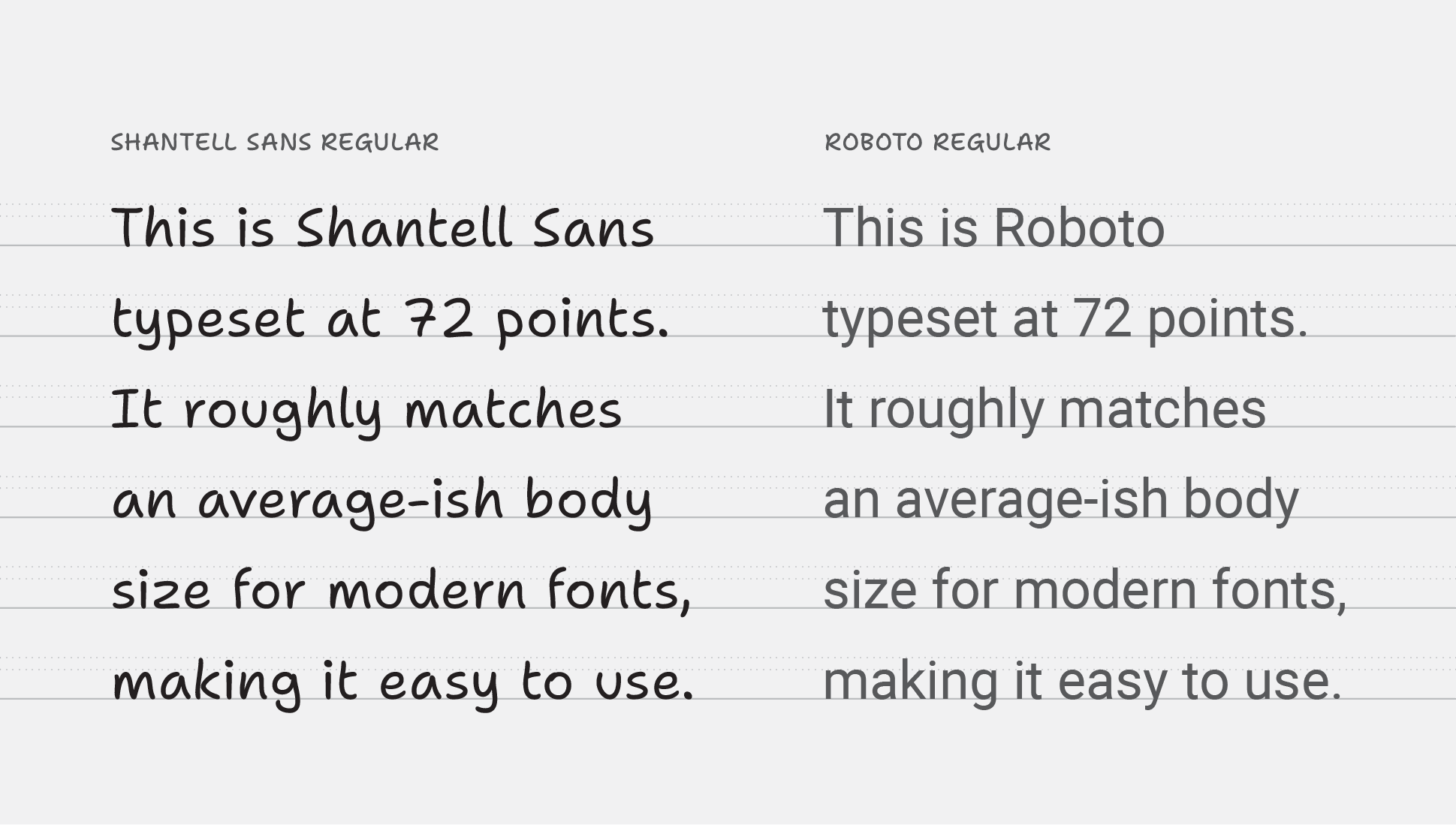
For the font to be easy to use in a wide variety of communication, it should align to typical expectations of proportions and styles for a modern font. To accomplish this, we set the font metrics of Shantell Sans (like cap-height, x-height, and default line height) to be close to those of commonly used fonts, such as Roboto. To keep things easily readable and to keep visually consistent with Shantell’s writing, we used slightly wider-than-average glyph widths and spacing.
These decisions help make Shantell Sans easy to use in everyday scenarios like websites, apps, presentations, and more. It has enough personality to be striking in large sizes, but is carefully made to work well in smaller text.
3. Usable and Available
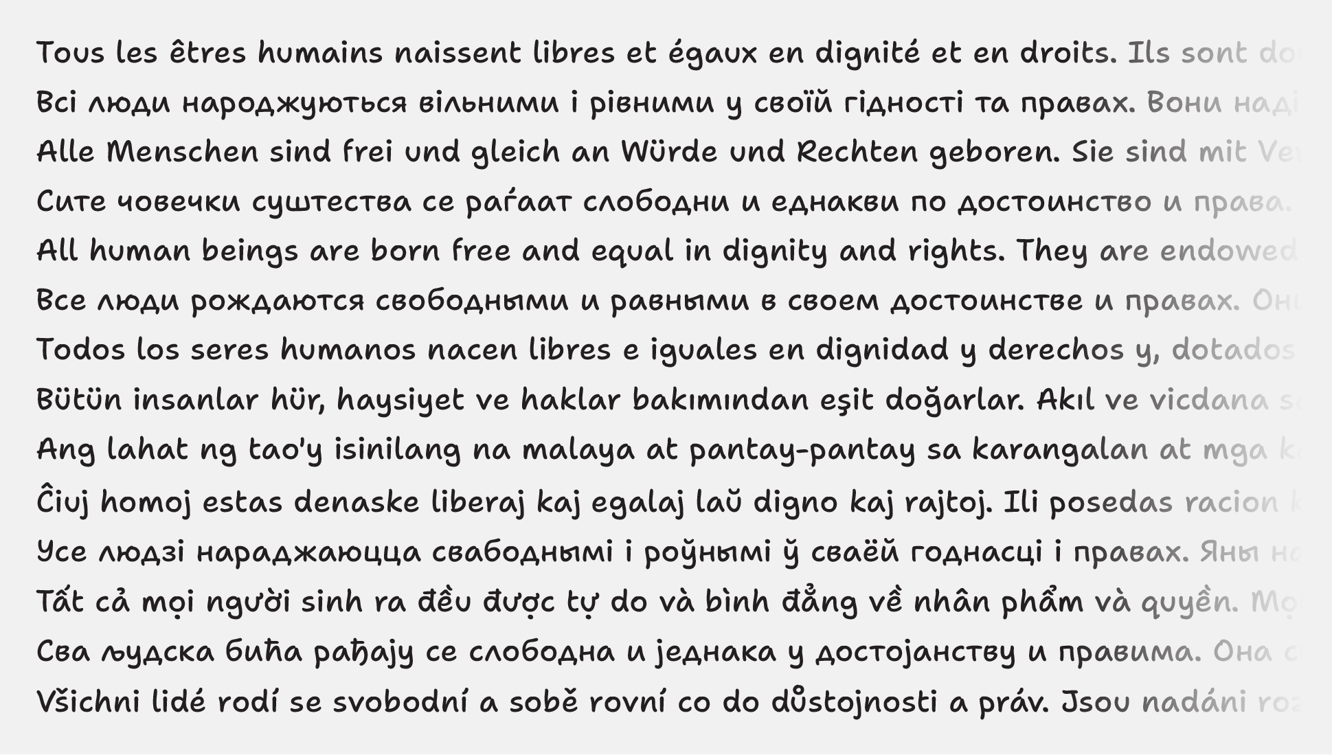
For the font to be usable by a wide range of people, it should support a wide range of languages. Shantell Sans follows (and slightly exceeds) the Google Fonts glyphsets Latin Plus and Cyrillic Plus, so it supports 380+ languages using Latin & Cyrillic scripts, throughout Europe, the Americas, and central Asia.
To make the font available to the widest range of people possible, we decided to release it as a free to use, open-source font. Releasing under an OFL license, with support from Google Fonts, helped make this possible.
4. Easy to Read
To make sure the font met Shantell’s goals of making an easy-to-read font, I made sure that the characters could be distinguished from one another. Shantell naturally writes letters like b, d, p, q and n and u that are clearly differentiated from one another through a contrast of simple shapes and well-placed exit strokes. Shantell sometimes writes the uppercase I and numeral 1 as only straight lines. To keep these letters distinct, I added serifs to the uppercase I and a flag to 1”
The lowercase n and u are differentiated because the n has a typical, “zig-zag” form, while the u has a simplified form without a tail or exit stroke.
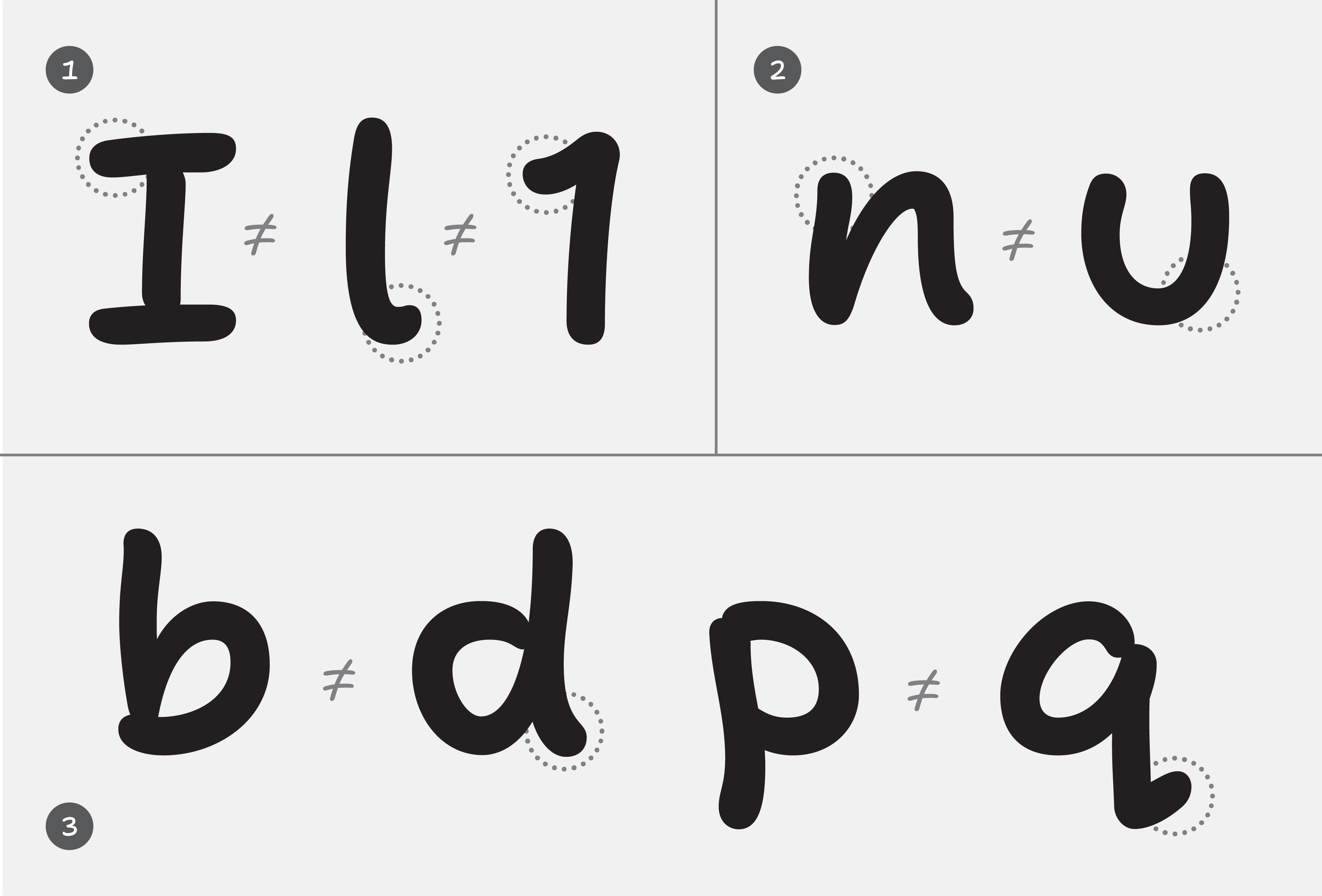
As you might expect in a handwritten font, the a and g use the single-story forms that kids tend to learn in school, keeping the font friendly and familiar.

5. Do something new
To do something new, the font should have not only a good range of weights. This wide stylistic range should be available in a variable font to also offer more creative utility to designers & developers willing to explore a little more in the capabilities of modern typography.
To take the creative possibilities even further, I wanted to see how I might bring in some of the free, organic spirit of Shantell’s work into some experimental axes within such a variable font.
And finally, to make sure the typeface would support the needs of detailed typography, it had to also include OpenType features like tabular vs proportional figures, fractions, and localized forms.
Beyond just my many feelings towards Comic Sans, I felt incredibly lucky to have the chance to create a font based on the handwriting of an artist who uses lines & letters in a unique, familiar-yet-unfamiliar way. I love handwriting-based fonts like Inkwell, Cortado , and Studio Lettering, and I wanted to bring some of the craft and details of such “elevated” handwriting fonts into the project, rather than making yet another auto-traced felt marker font. (Though, those fonts also have their place!)
Design & Production
After establishing some core goals of the project with Shantell, we set to work.
Shantell chose a favorite medium-sized felt tip marker (Staedtler Lumocolor M) and wrote several uppercase & lowercase pangrams (sentences including all letters of the alphabet). She also wrote strings of numbers, punctuation, and symbols, plus a few words with accented characters.
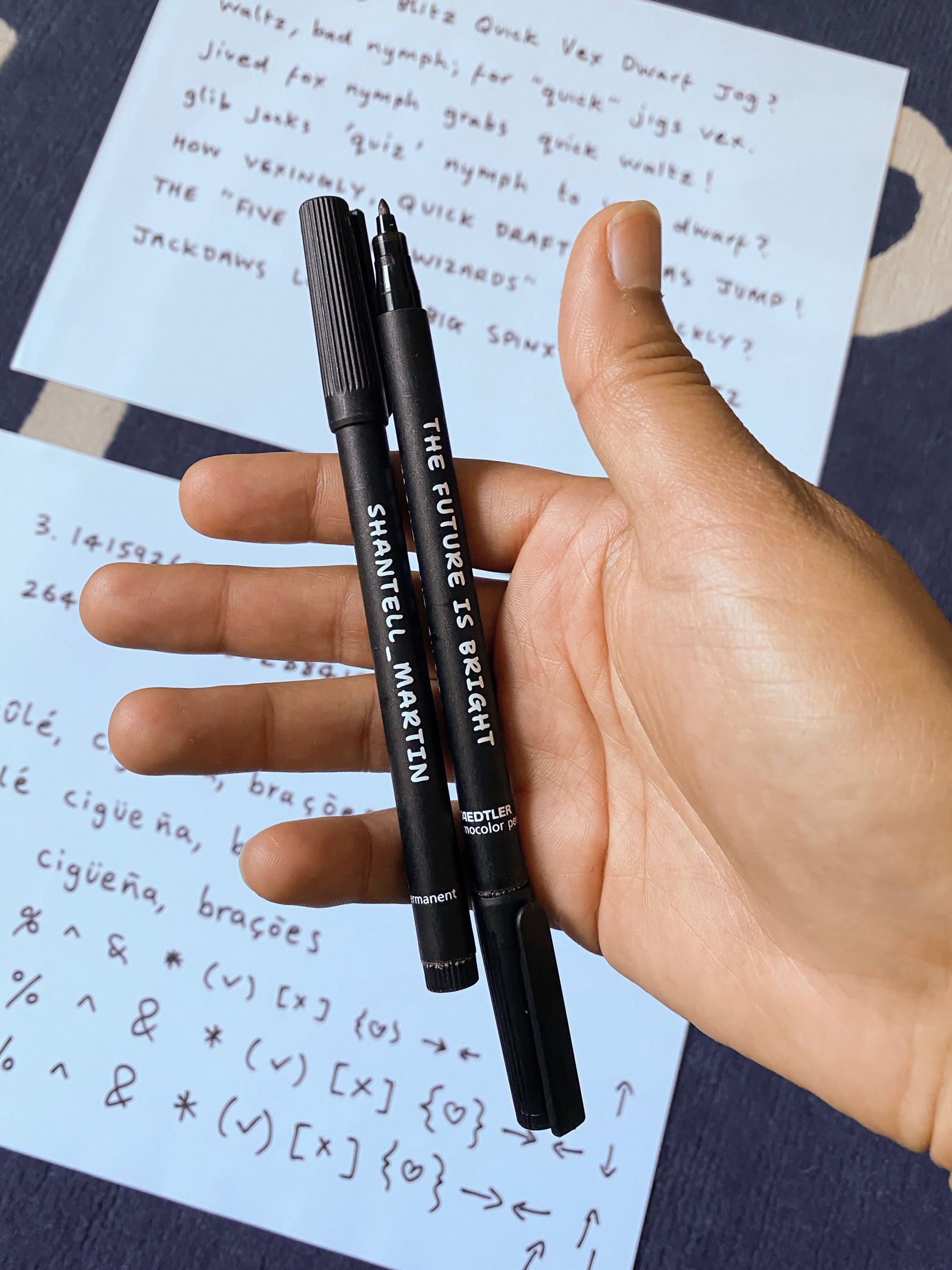
She scanned these, and I set to work tracing them – starting with a centered line through the pen strokes, then expanding this into Light and ExtraBold strokes. Because Shantell’s original writing includes a lot more variation in sizing and rhythm than the fonts we are all used to reading, I subtly modified the character proportions to have somewhat-normalized, consistent heights, widths, and spacing. But, key aspects of letter shaping were retained, like the way the crossbars Shantell’s t and f don’t go left of the main stems, the way the A and R start from the top left but the P is a simple loop starting from the bottom left, and the way the M and W are continuous waves rather than separate diagonal strokes.
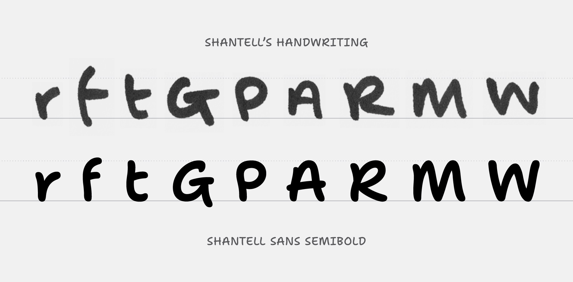
We then explored which direction to go in, aesthetically: should the glyphs be truly monolinear, with circular endcaps – similar to Comic Sans – or should they retain more of the organic, sometimes sharp shaping of the felt-marker writing? Neither extreme felt quite right, so we opted to go for something in the middle: strokes are drawn with a little bit of the sharpness and contrast that helps make Shantell’s writing so engaging, but they are also made a little more uniform in thickness and given softened, semi-rounded endings. This strikes a balance, retaining a sense of marker writing while also being approachable and warm in their digital form.
New variable axes
Once we had a solid basis for the project, I worked backwards a little bit: I made additional styles that took those “normalized” fonts and reintroduced some of the irregularity of the scanned handwriting samples. You might expect this irregularity to be totally random, but it actually had certain repeating traits.
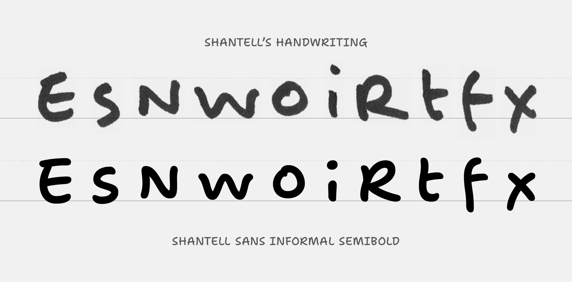
Letters with more horizontal strokes (like the E and e) tended to be taller than others while letters with more vertical strokes (like the M and W) tended to be wider and shorter. Simple shapes (like the P) tended to be smaller, while horizontal bars (like on the G, R, and t) tended to extend in a quick, long exit stroke. I still didn’t want to make the font too chaotic to be useful, so it was a balancing act to pull in more personality, but still keep things “font-like.”
With these “main sources” created, I then entered another, somewhat more nerdy phase of the project: using Python code to generate the sources I could build into the full set of working variable & static fonts. Normally, there wouldn’t be any separation between the drawn sources and the buildable sources, but Shantell Sans is a little different. The final fonts include stylistic axes for Bounce and Informality, and these aren’t styles I drew entirely by hand. Instead, a script was used to A) make Bouncy styles in which glyphs are shifted up or down, and B) make Informal styles in which glyphs are interpolated between the “normalized” & “irregular” main sources. All sources were given several alternates of letters, numerals, and key symbols, so that the final fonts could rotate between these alternates in a pseudo-random way, ultimately giving the appearance of energetic writing. As these are variable axes, this effect can be applied with a range from subtle to pronouced.
Was this last part necessary? Probably not. Was it easy? Nope. Is it cool? I think so! Aside from its obvious and fun possibilities of bouncy and/or irregular typography, these experimental styles enable animated type that doesn’t just sit still, but rather pulses and undulates in a familiar-yet-unfamiliar way. Sure, this type of animation could be achieved with any font with enough work in After Effects or through manipulation with JavaScript, but like many things in type, the value here is that it makes a new aesthetic available in a way that is not only easy to use but also deeply considered along with the design of a cohesive system.
Extending the typeface for Google Fonts and open-source release
Because Shantell was interested in releasing Shantell Sans as an open-source project, we reached out to see if Google Fonts might be interested in sponsoring a few extensions to make the typeface even more useful to an even wider audience.
With support from Google Fonts, we extended the stylistic range of the typeface, creating a full set of Italic styles. We also added in a new, experimental axis: Spacing, which adds extra spacing between letters. This can be useful in software that doesn’t support that option by default.
Best of all, we also extended the fonts to include wider language support: the Latin script was expanded with Vietnamese characters and many more currency symbols, but even more notably, a whole new set of languages was given support through the addition of Cyrillics!
Designing Shantell Sans Cyrillic
Anya Danilova, Type Designer
Cyrillic is the script of many languages in Eurasia: Bulgarian, Serbian, Russian, Belarussian, Ukrainian, Tatar, Bashkir and many more.
The process of designing for Cyrillic is relatively similar to designing for Latin, unlike for example designing Arabic, where there is a very different system of writing. In Cyrillic, some glyphs are the same as in Latin, some require more attention, and some are easy to make. However, the process can become challenging once we talk about unconventional shapes or, in our case, about a typeface that was inspired by the handwriting of a specific person.
Working on another script for a handwriting typeface can feel somewhat similar to translating poetry. When you translate a poem to another language, how can you save the unique tone of it while also using the structure of the language you are translating it to? Which aspects are specific to an author, which are idioms, which are slang, and how can it be translated to save its meaning and rhythm? I had similar questions while working on Shantell Sans Cyrillic.
Cyrillic can be quite prolific with a variety of shapes. There can be upright (AKA “printed”), italic, and cursive shapes in Cyrillic. Some italic and cursive shapes are different in structure from the “usual” printed ones.
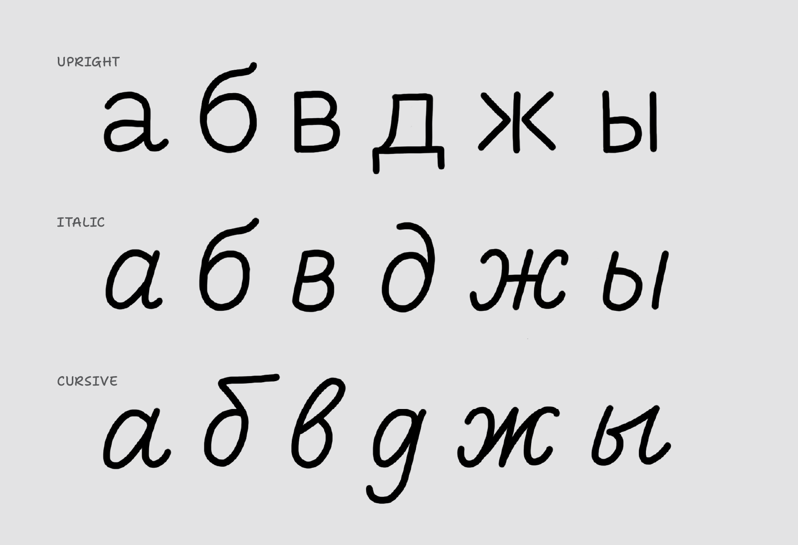
Shantell’s handwriting is a mixture of cursive and printed shapes, which is a common thing: in the UK and in the US, children are taught first cursive shapes, then printed ones. My own handwriting is a mixture of two, as well. But, Shantell writes only in Latin, so I had to figure out how to translate her shapes into Cyrillic. Which letters would be cursive, and which ones printed?
We asked Shantell to write a couple of sentences in Russian, just to see her approach to these unfamiliar shapes. I wanted to be as unbiased as possible, so I asked her to write a few words multiple times, with different shapes for the same letters.
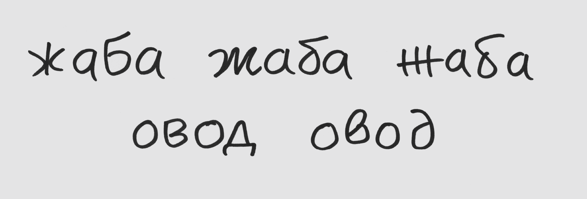
I tried these letterforms in the font. There were very few clear answers on what Cyrillic shapes should look like in Shantell Sans, so I explored many versions of characters to compare shapes in text and in different languages.
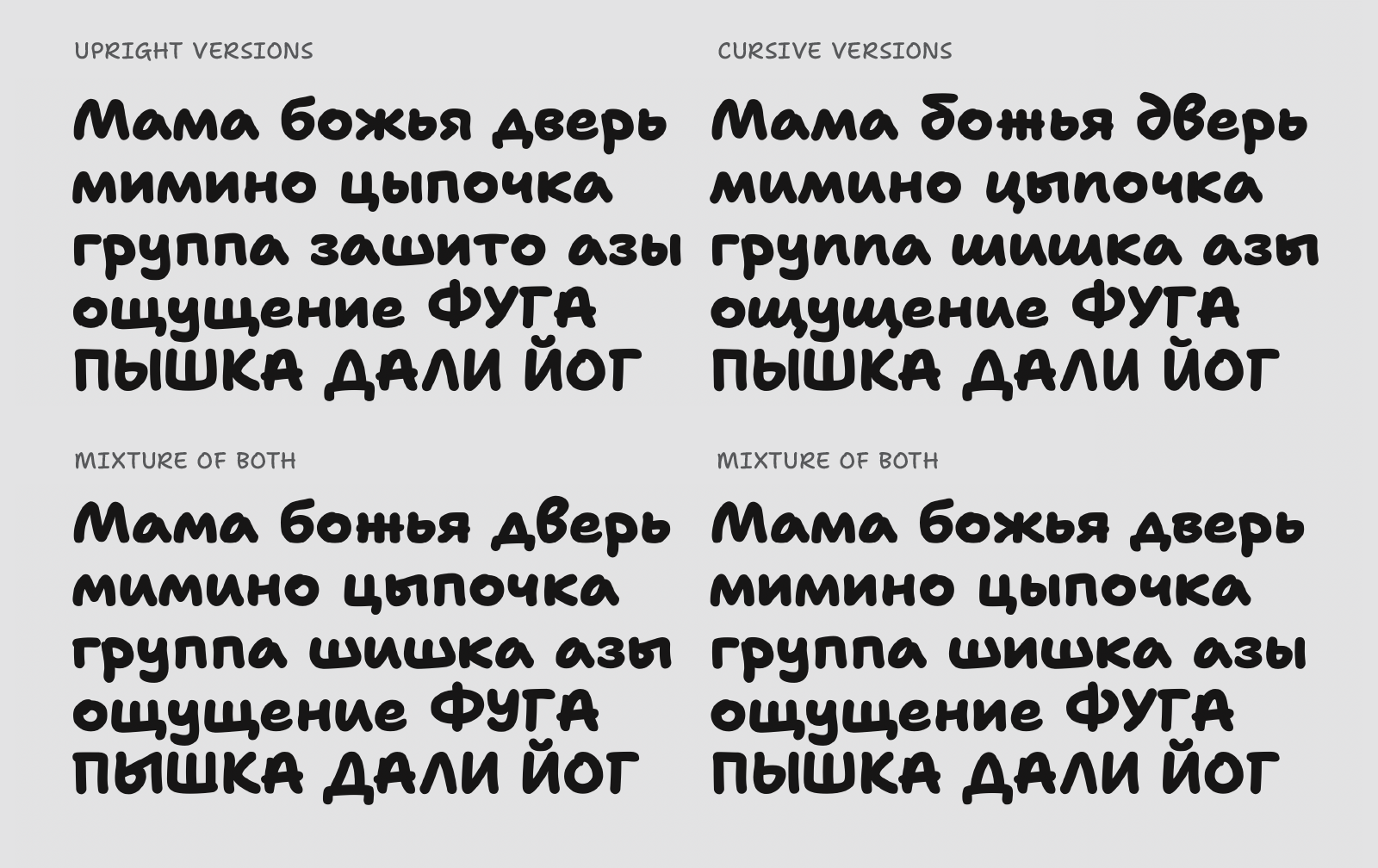
It was a matter of a feeling: some shapes felt right in this typeface, while others – even when they typically should be written in a different way – felt wrong. I had the pleasure of consulting with fellow Cyrillic type designers Maria Doreuli, Krista Radoeva, and Alexei Vanyashin, and most of the time “the feeling” of right and wrong shapes was the same for us.
In Bulgarian and Serbian languages, which usually have some conventional shapes that differ from default Cyrillic, I had to give my attention to the unexpected ones: for example, the Bulgarian t that is usually the same shape as the Latin m. I had to adjust it, as in this particular style and font it felt like it might be confused with the Cyrillic m.

Usually, shapes that look similar in lowercase and uppercase have a similar approach, but in Shantell Sans, a lot of them are slightly different, in order to keep the lively handwriting feeling. With letters like the Serbian nje, I had to be sure both shapes would look natural to a native reader. That’s why I also consulted designer Jovana Jocić for the Serbian language.
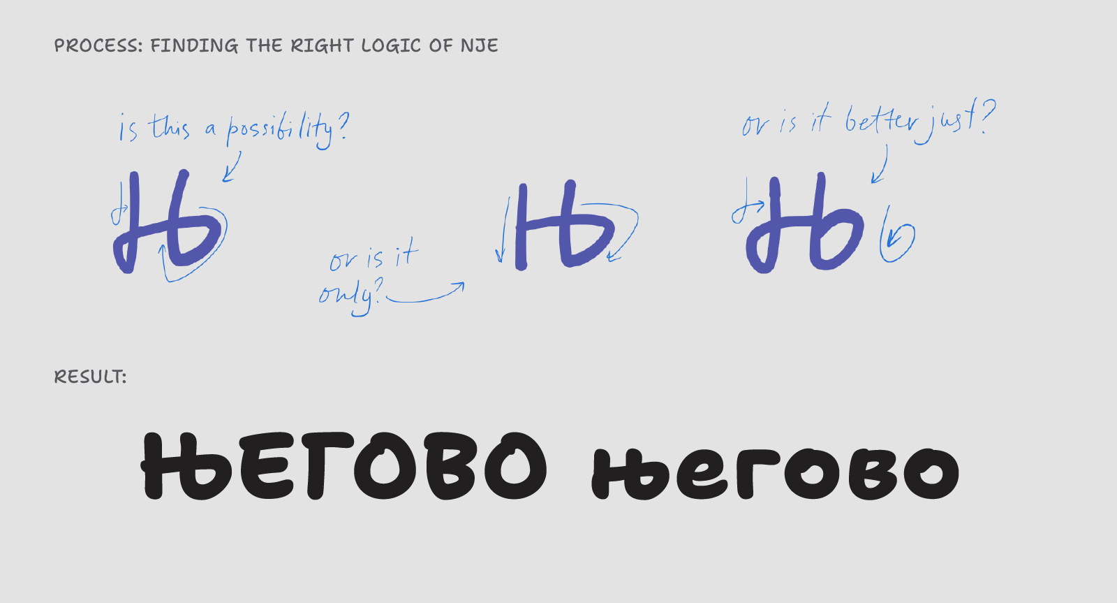
Overall, it was an incredible pleasure to work on this project, and its many design challenges only made working on Cyrillic more interesting.
I am excited to see how this typeface would be used and hope to see it being handy for typesetting in different Cyrillic languages as well as Latin.
Thanks for reading!
Hopefully, learning about the background of Shantell Sans helps you have a deeper appreciation of not only this typeface, but of the type design process more generally.
Do you have a creative idea that needs a font with some personality? Want to just take a new font for a spin and see where it takes you? Give Shantell Sans a try!
You can get Shantell Sans on Google Fonts or download the very latest version in the open-source repo.
You can also use Shantell Sans on Google Docs, Slides, and other Workspace products:
- In a document, open the font menu and click “More Fonts”
- In the pop-up panel that opens, search for "Shantell Sans”
- Click on the family to add it to your fonts menu
Note: The Google Material Design Blog has a simplified version of this article.